Where Are We Headed with Colors in 2026?

Let me tell you what happened with Pantone’s Mocha Mousse last year. Design blogs lost their minds. Every magazine cover screamed about this “revolutionary” milk chocolate shade. And you know how many of my boutique lodging clients actually used it? Zero. Not because it was ugly—it wasn’t—but because it had nothing to do with the real work of creating memorable guest spaces.
That’s the problem with chasing color trends. Most of them are designed to sell paint and home décor products to suburban homeowners redecorating their powder rooms, not to help you compete against the Marriott down the street.
But here’s the thing: some trends actually matter. And 2026’s emerging palette tells us something important about where hospitality is headed.
The Colors Everyone’s Talking About (And Why You Should Care About Some of Them)
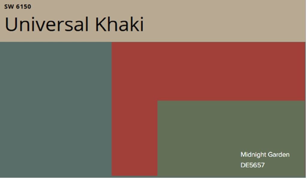
The paint companies have spoken, and nature is still the star. Dunn-Edwards picked Midnight Garden, a moody deep green that looks like a forest at dusk. Sherwin-Williams went with Universal Khaki, which is basically what you get if beige and taupe had a baby that grew up listening to meditation podcasts. Krylon calls their pick Matte Coffee Bean, though I’ve never seen a coffee bean that particular shade—maybe they’re buying different coffee than I am.
Then there’s the drama camp: Behr’s Hidden Gem and Veranda’s Silk Road Red, both jewel tones that want you to know they read “Vogue” and have opinions about cocktail culture.
Here’s my take: the neutrals are safe but boring. The gem tones are exciting but risky. And the green? That’s the one I’m actually betting on for 2026.
Why Midnight Garden Might Actually Matter
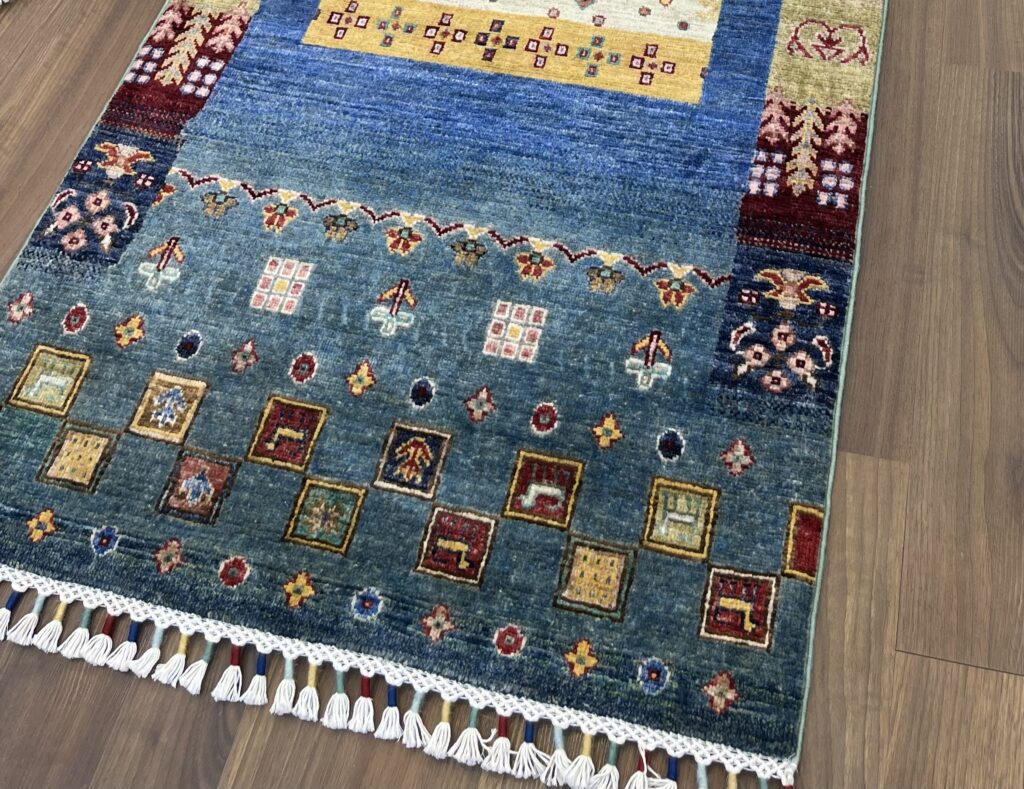
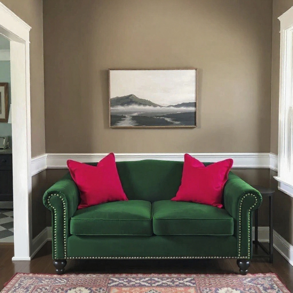
I worked with a property in Greenwood last fall—traditional ‘90s bones, trying to compete with all the new builds popping up. We used a green similar to Midnight Garden as the hero color in their guest rooms. Paired it with bronze lighting, walnut furniture, and cream-colored bouclé upholstery. It along with other jewel tones found their way into a great, hand-knotted runner from Istanbul for the hallway!
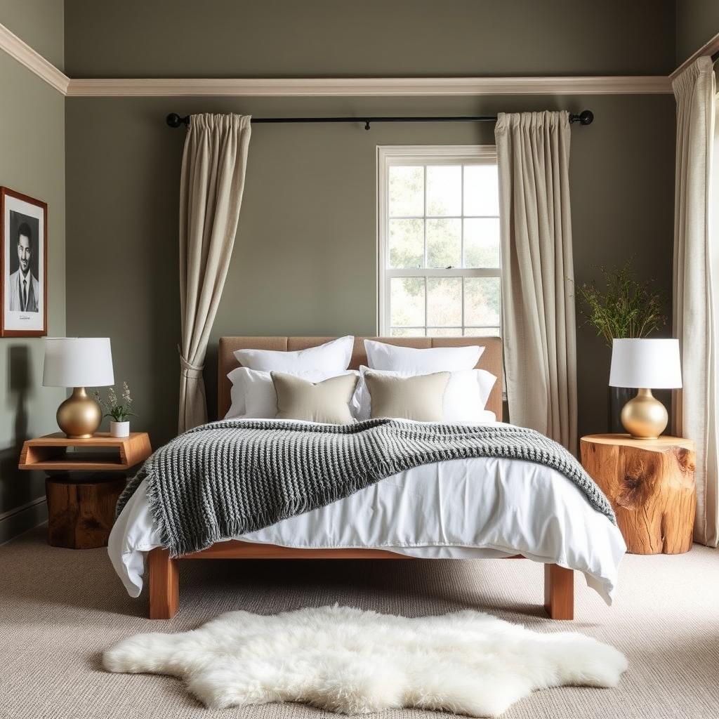
The space went from “nice but forgettable” to “I need to take a photo of this.” Why? Because deep, sophisticated green feels both current and timeless. It photographs beautifully in natural light. It works with the biophilic design trend without looking like you’re trying too hard. And critically, it doesn’t read as “someone picked this from a 2026 trend report”—it just feels right.
The trick with Midnight Garden (or any deep green) is commitment. You can’t do it halfway. It needs good lighting—both natural and artificial warm light—or it dies. It needs breathing room, which means your adjacent walls should be light and neutral. And it absolutely demands quality materials around it. Put it with cheap finishes and it’ll make everything look cheaper. Put it with natural wood, stone, good textiles, and suddenly your 1980s building looks like it belongs in a design magazine.
The Neutrals: Useful But Not Exciting
Universal Khaki and those warm near-whites are the comfort food of hotel design. They won’t offend anyone, they make spaces feel larger, and they’re incredibly forgiving with different lighting conditions. I spec these constantly for guest rooms, especially for properties doing that Scandinavian-minimalist thing that Gen Z and young millennials actually book. And they are a move away from the ever pervasive millennial gray.
But here’s what nobody tells you: these colors are only interesting when you layer the hell out of textures. Khaki walls with khaki carpet and beige linens? Boring. Khaki walls with a chunky knit throw, linen curtains, a sheepskin rug, and some rough-hewn wood? Now you’re speaking the language of quiet luxury that actually works.
The other truth about neutrals: they’re a background, not a personality. If your entire property is neutral, you better have knockout architecture, incredible art, or a view that does the heavy lifting. Otherwise, you’re just… pleasant. And pleasant doesn’t get bookings.
Gem Tones in Restaurants: Proceed With Caution
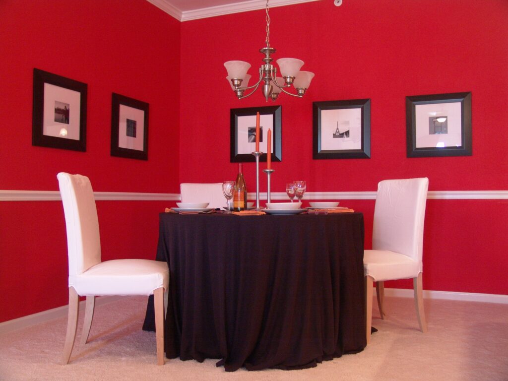
Silk Road Red and those deep jewel tones? I’m conflicted. On one hand, I designed a dining room two years ago using a similar deep red, and it’s still raising the average order total. Red makes people hungry so they order more! The color creates instant intimacy and drama—exactly what you want when you’re trying to get people to order dessert or another bottle of wine.
On the other hand, while jewel tones are on the ascendancy, we’re about 18 months from them feeling dated. The shelf life of “bold accent colors” in restaurants is brutally short. Remember when everyone did that deep teal situation five years ago? Now it screams 2020.
If you’re going to use gem tones, do it in a space you can easily repaint or reupholster. A feature wall behind the bar? Sure. Your entire dining room? That’s a $50,000 mistake waiting to happen in 2028 when everyone’s moved on to whatever comes next.
What Actually Works: The 70-20-10 Reality
After 23 years of doing this, here’s the formula that doesn’t fail: 70% neutral (your walls, your big furniture pieces), 20% your “personality color” (could be that Midnight Garden, could be a warm terracotta, whatever fits your story), and 10% accent (your pillows, your art, your seasonal refresh).
This ratio lets you ride trends without committing to them. Want to test out jewel tones? Throw pillows and artwork. Hate it in six months? You’re out $800, not $80,000.
The real secret isn’t picking the perfect trendy color. It’s creating a cohesive story where color supports your concept instead of being your concept. I’ve seen properties with “boring” colors that feel incredible because every choice ladders up to a clear point of view. And I’ve seen properties that chased every trend and feel like a Pinterest board threw up.
My Actual Recommendation for 2026
If you’re refreshing any public spaces this year, consider a sophisticated green as your anchor. Not lime, not mint, not that sad sage everyone did in 2022—a real, deep, grown-up green. It’s having a moment, yes, but it’s also versatile enough to outlast the moment.
For guest rooms, stick with warm neutrals but invest in texture and lighting. Skip the trendy accent wall; nobody books a room because of your paint choices. They book it because your photos make them feel something.
And if you’re dead set on jumping on a bold color trend? Do it in your smallest, most flexible space. Your bathroom. Your entryway. Somewhere you can pivot without a board meeting.
The properties that win aren’t the ones following color trends. They’re the ones using color to tell a story that actually matters to their guests. Figure out your story first. Then pick the colors that tell it best.
What’s your story?
About the author

James provides guest experience consulting and interior design for hospitality. Whether that is for an historical inn, boutique hotel, tasting room, or restaurant. His firm, Küster Design, specializes in creating one-of-a-kind interiors and experiences for its clients. James and his team focus on design that reinforces the brand; makes a statement about a property’s style and commitment to excellence. James’ commitment to understanding and shaping emotions within interior spaces has enabled him to create environments that not only captivate customers but also foster long-term loyalty for his clients’ businesses. Through the use of space, light, and textures, Küster Design tailors custom interior designs to each property’s unique needs, crafting interior branding messages that set his clients apart while prioritizing functionality and sustainability. The firm’s virtual design services allow them to design the experience remotely, which enables a quicker reaction time to clients and their needs. James is an active member of Cayuga Hospitality Consultants.
Contact Us
Share
Related Articles & Case Studies

Development & Acquisitions
Hotels
Operations & Management
An Island Resort Adventure: The Thin Line Between Rustic and Rundown
It’s been a few years since l was overseas at an island resort, so I thought it was time to venture out...

Food & Beverage
Hotels
Operations & Management
Algorithms, Artificial Intelligence, and the Essential Need for More Human Intelligence in Talent Acquisition Strategies
Algorithm-based applicant tracking systems (ATS) have been in place for over 20 years. Recruiters have generally come to rely on the algorithms...

Asset Management & Financial Services
Case Study
Development & Acquisitions
Hotels
Case Study: Hotel Opening Purchasing & Installation
A developer engaged a project management (PM) team and a large, reputable procurement firm for a high-end, dual-property coastal hotel development in...


